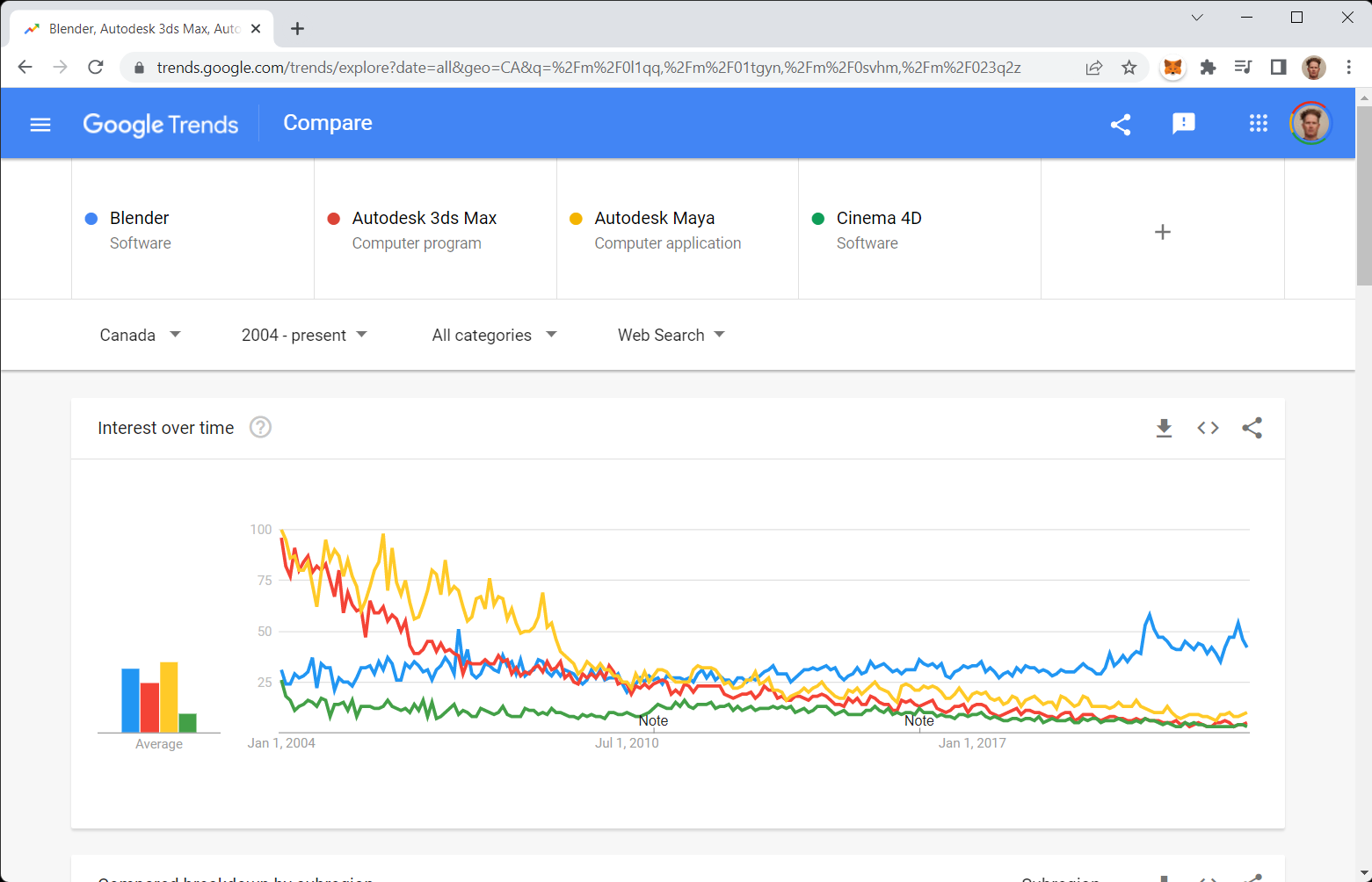
A post recently doing the rounds on social media (Twitter in particular) includes the below image with implicatory text about Blender winning the 3D Application Wars Of Attrition.

At face value the graph does appear to confirm this observation as the blue line indicates Blender is doing much better than ‘The Bigs’. This perception is misleading.
Looking more closely it’s clear over time there is a slight but steady increase in Blenders popularity, the larger gains towards 2018/19 attributed to the release of 2.8 series. The Bigs on the other hand, their drop-off’s are much steeper pre 2010 (c. Blender 2.50 timeframe but not related to that at all), then much more gradually 2010 onwards.
But here’s the thing about that; the combined rate of drop-off from 3DS Max, Maya and Cinema 4D is not reflected in a commensurate uptick in Blender, they appear in fact, to have little impact at any point in Blender 3Ds popularity, which itself appears to correspond more to major releases than anything the graph might indicated.
So where are they? What’s happened to this ‘popularity’?
Furthermore, the chart doesn’t appear to track changes that were supposed to have occurred when The Bigs shifted to the subscription-based sales model. Odd considering how much digital ink the issue got at the time.
So what exactly does this, and other charts like it, reveal? And exactly how useful are they in deciding one way or the other what to do about something, anything, never mind Blender 3Ds ‘trending’ nature.